

Paul Hom Asian Clinic
Team
I worked with three other peers to collectively design this website
My Role
Homepage Design
Header Design
Persona
Competitive Analysis
Style Guide
Tools
Figma
Adobe Illustrator
Iterations
4 Main Iterations
6 Major Frames
The Context
The What…
The Paul Hom Asian Clinic's website is outdated and not user-friendly, especially for its target audience of underserved and uninsured Asian populations aged 35–50. The current design fails to meet the needs of users with diverse backgrounds and low computer literacy.
The Why…
Improving the website will ensure that it better communicates the clinic’s mission, provides easier navigation for both new and returning users, and caters to the specific needs of an older audience with low computer literacy. A cohesive design will enhance accessibility and simplify the user experience, aligning with the organization’s goal of serving vulnerable populations.
The How…
Re-design the website with a cohesive and consistent styling and branding guide that focuses on simplicity and accessibility. The updated design will prioritize ease of navigation, clarity, and responsiveness to the needs of the 35–50-year-old age group, creating a user-friendly experience for Paul Hom's patients.
My Design Process

Empathize
Learn about the guidelines of clinic sites through competitive analysis

Ideate
Generate ideas for mobile mockups and establish a cohesive brand identity
Leverage insights to inform the importance of features within information architecture

Define
Create an early model of the product that demonstrates functionality (Sketching, Wireframes, and Prototyping)

Prototype
Facilitate user testing to identify areas for future iteration and these after changes hand off designs to the Dev team

Test
User Research & Findings
I conducted user research via competitive analysis to establish a usability baseline. With the understanding of Jakob’s Law, we considered these findings for aligning with user expectations.
I analyzed similar healthcare websites to identify patterns that informed a user-friendly design.
User Persona

Ideation
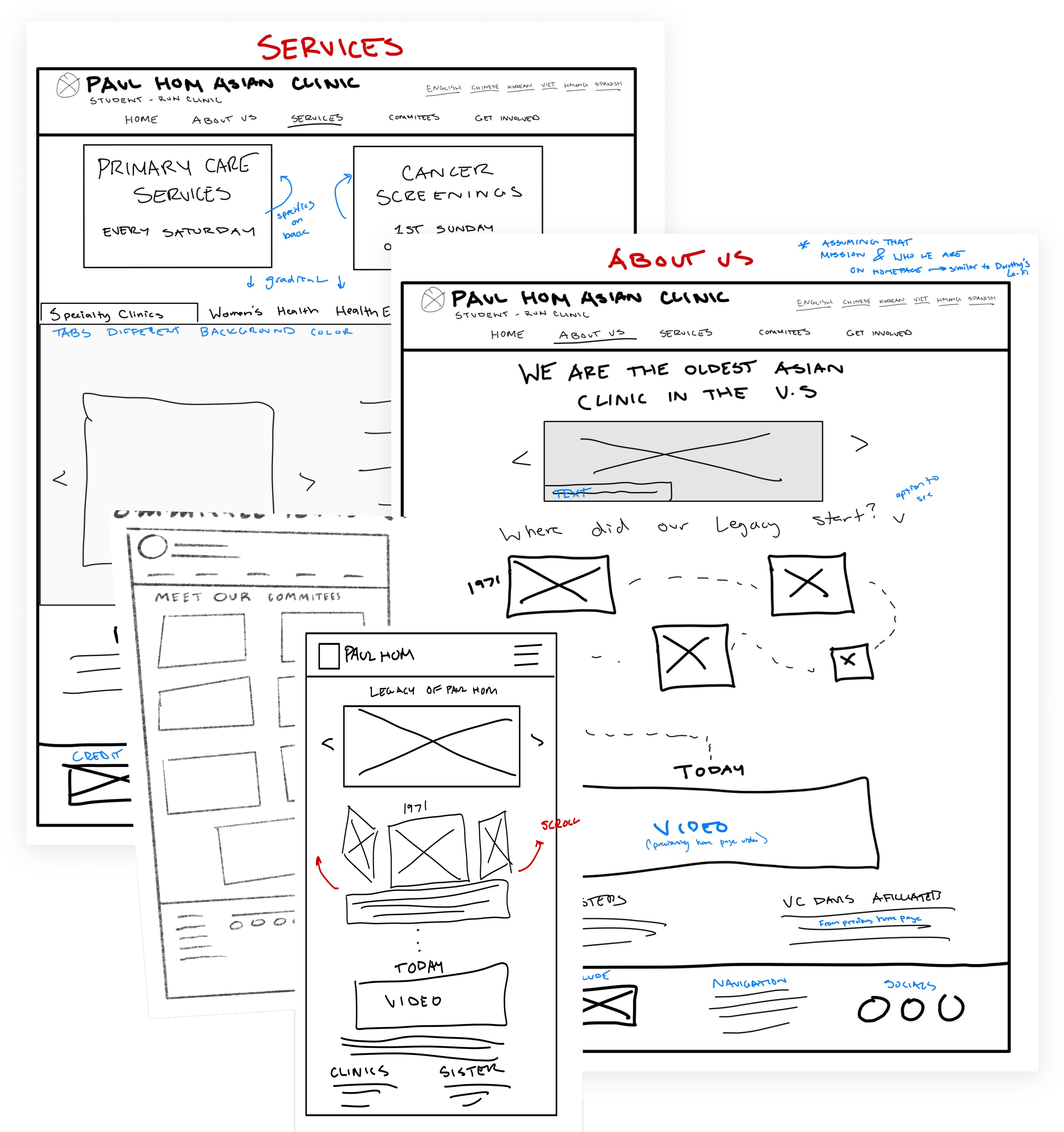
Sketches
We leveraged sketches to explore and develop potential solutions for improving the user interface. We identified opportunities to enhance usability by streamlining the design, such as:
Removing dense blocks of text
Introducing a clean intuitive navigation bar
This process allowed us to refine our ideas collaboratively, ensuring each proposed solution aligned with user needs and design principles.
Mid-Fi Prototypes
Mobile and Web
Original Site
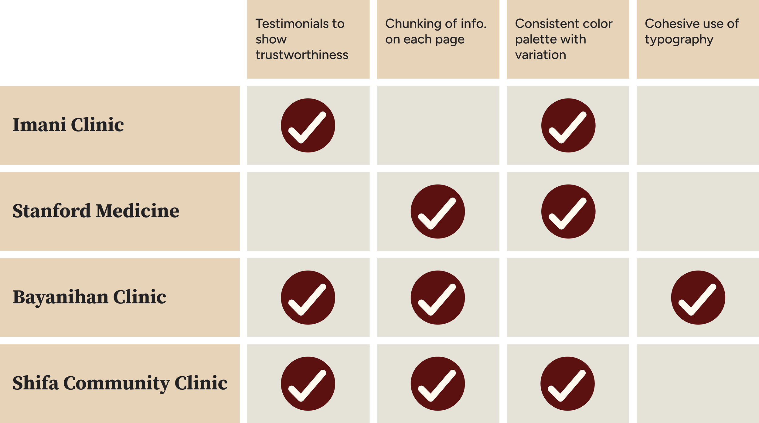
We conducted a competitive analysis of several clinic websites, including the Imani Clinic, Stanford Medicine, and Bayanihan Clinic. This analysis highlighted key components that contribute to seamless navigation and usability. The insights gained directly informed our design choices, ensuring our solutions were both user-friendly and aligned with industry standards.
Re-Design Wireframes


Increasing Font Size
This was implemented this to cater towards an older demographic, improving readability and ensuring accessibility for users with visual impairments.
Language Selector
This feature was implemented to ensure the interface is accessible and user-friendly for non-native English speakers, promoting greater inclusivity on the site.
Using Columns to Keep Elements Consistent
Using columns ensures consistency, reduces clutter, and maintains alignment, creating a clear and cohesive user experience and a predictable visual hierarchy.
Sticky & Consistent Header
This was implemented this to ensure key navigation elements remain accessible to users as they scroll, enhancing usability and reducing cognitive load.
Remove Hyperlinks as Buttons
This aimed to simplify the interface by reducing confusion between navigational elements, and ensure a clear distinction between interactive and static content for better usability.
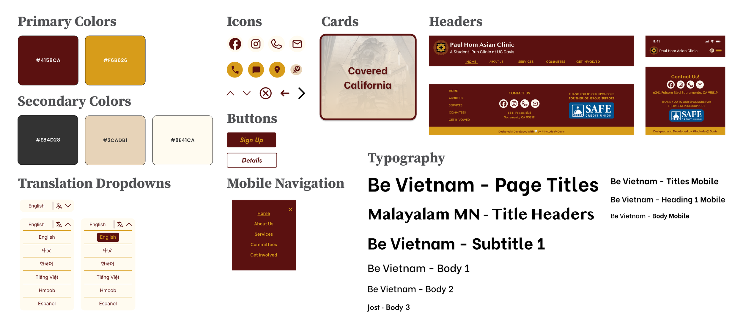
Style Guide & Visual Design
Our approach for the visual design was to create a color palette that reflects the Paul Hom Asian Clinic's heritage and commitment to the community it serves. We replaced the original purple with maroon, gold, beige, and an off-black color to evoke a sense of warmth, tradition, and professionalism.
For typography, we ensured clarity and readability to enhance user comprehension and accessibility, especially for users with diverse visual needs. Consistency was maintained through a structured page layout, creating a cohesive and accessible user experience.
Final Hi-Fi Prototypes
When designing the clinic’s website, we prioritized readability to ensure it was user-friendly, particularly for older adults who frequently visit the site.
To achieve this, we:
combined interactive elements with clear visual hierarchy and text presentation
focused on key factors such as color, contrast, font type, size, and weight to enhance clarity and accessibility.
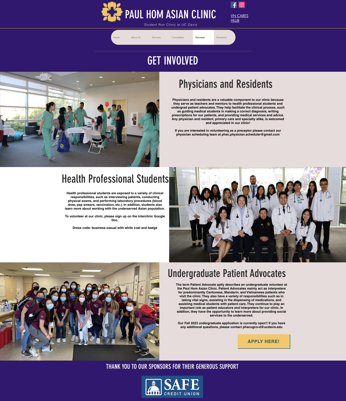
High Fidelity for Web - “Get Involved”
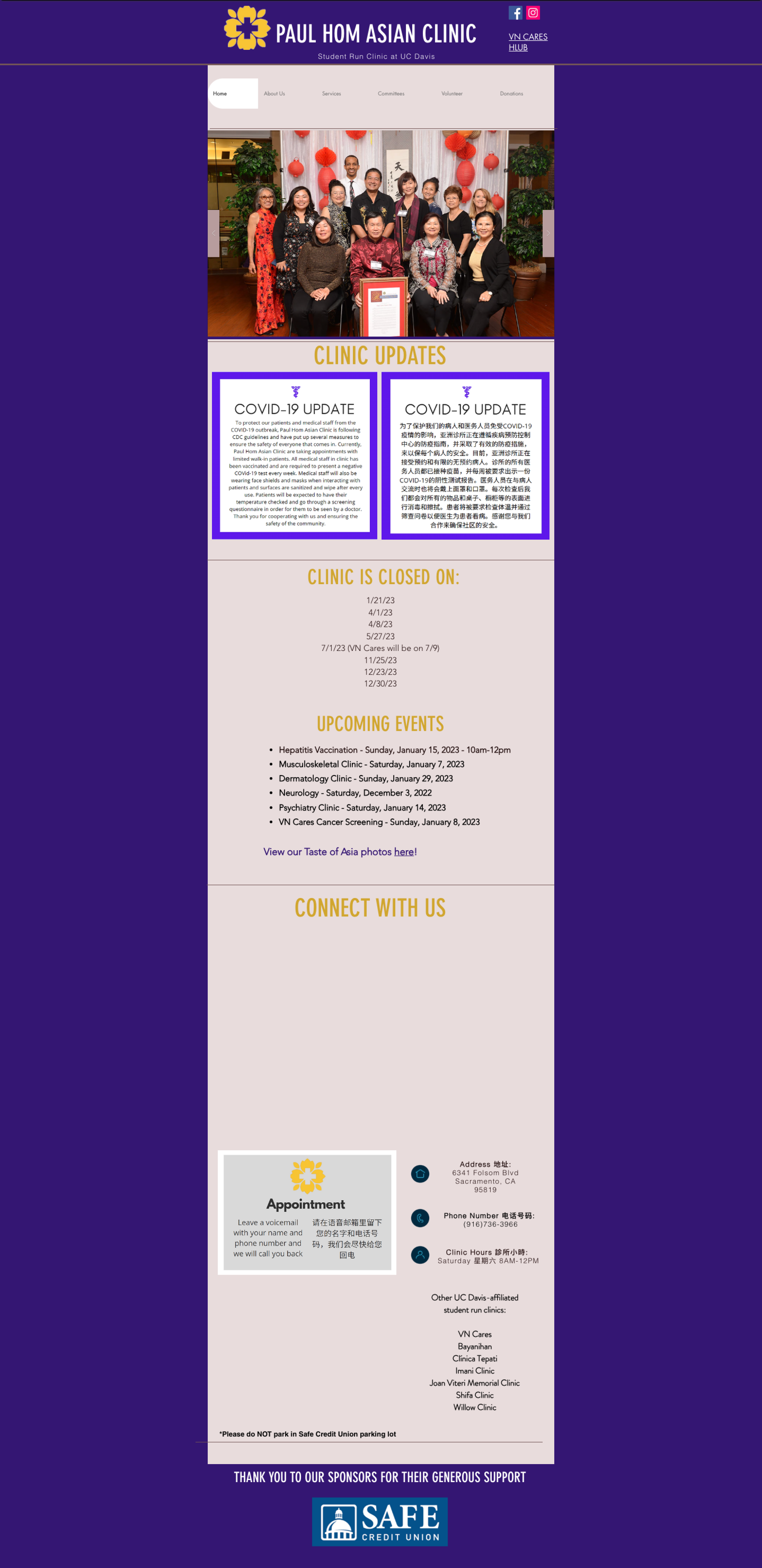
Before - Original Site
Volunteer Page
Donations Page

After - Updated Design
Updated to “Get Involved”

Streamlining Info
Merging ‘Volunteering’ and ‘Donations’ pages streamlines navigation. As the Donations tab mainly listed an address, merging pages allows for key information to be accessed with fewer clicks.
Simplifying Options
We replaced bulky text blocks with buttons to reveal volunteering details and aligned images in a single row with uniform size and height, creating a cleaner and more cohesive design.
Improving Sign-up Clarity
We replaced the single sign-up button with individual buttons under each volunteering option, ensuring users can easily register for their preferred choice without confusion.
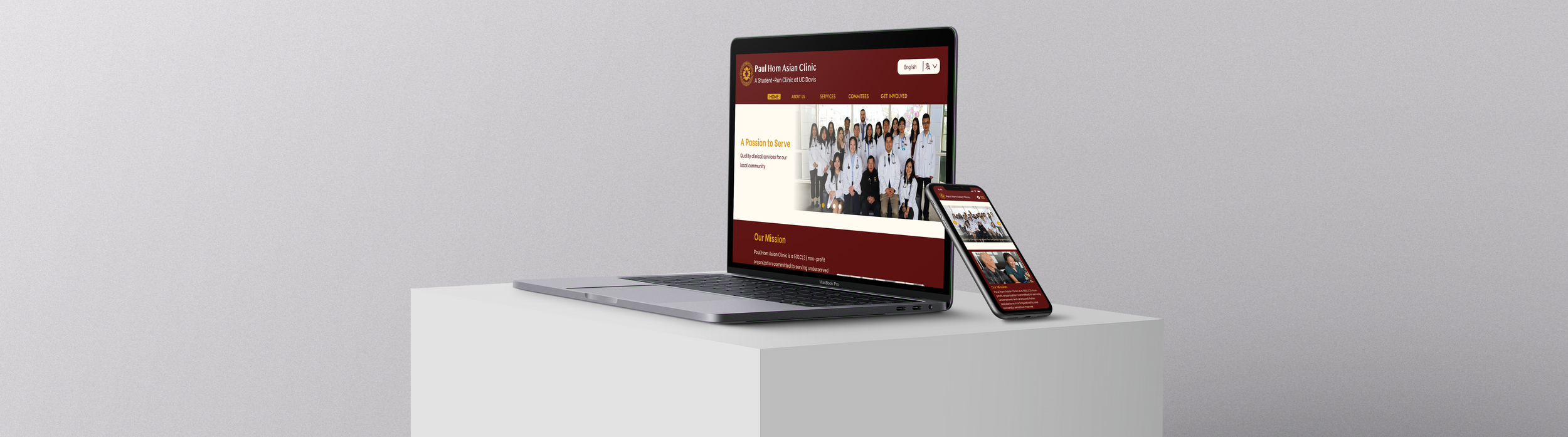
High Fidelity for Web - “Home”
Before - Original Site
After - Updated Design
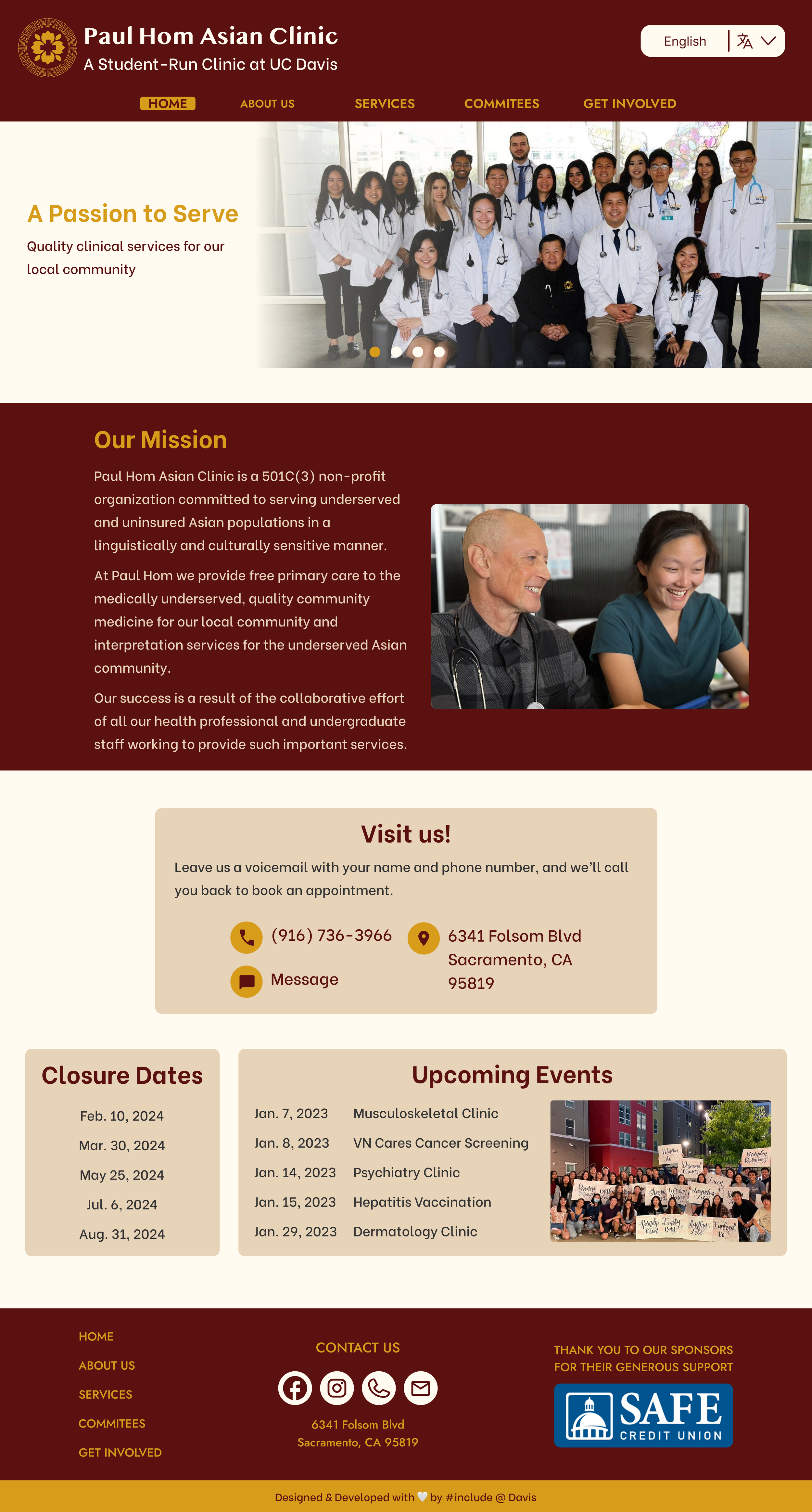
Inserting Images
This creates an emotional connection with users by visually representing the clinic’s mission and community. Strategically chosen and placed images also break up text-heavy sections, enhance visual appeal, and guide users’ attention, contributing to a more engaging and user-friendly design.
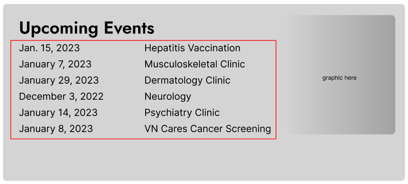
Consolidating Closing Dates & Upcoming Events
This improves usability by reducing cognitive load, minimizing navigation time, and allowing users to stay up-to-date on important updates and events by centralizing essential information.
Showcasing the Mission
This was implemented to draw immediate attention to the clinic’s core values and purpose, ensuring it stands out as a focal point. This design choice leverages the use of space and hierarchy to create visual impact while maintaining a clean and balanced layout.
High Fidelity for Mobile
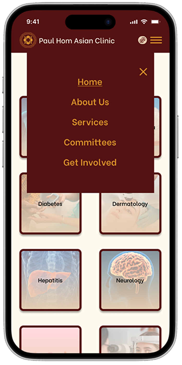
As there was no mobile version prior, we implemented a hamburger navigation option to display the different page options.
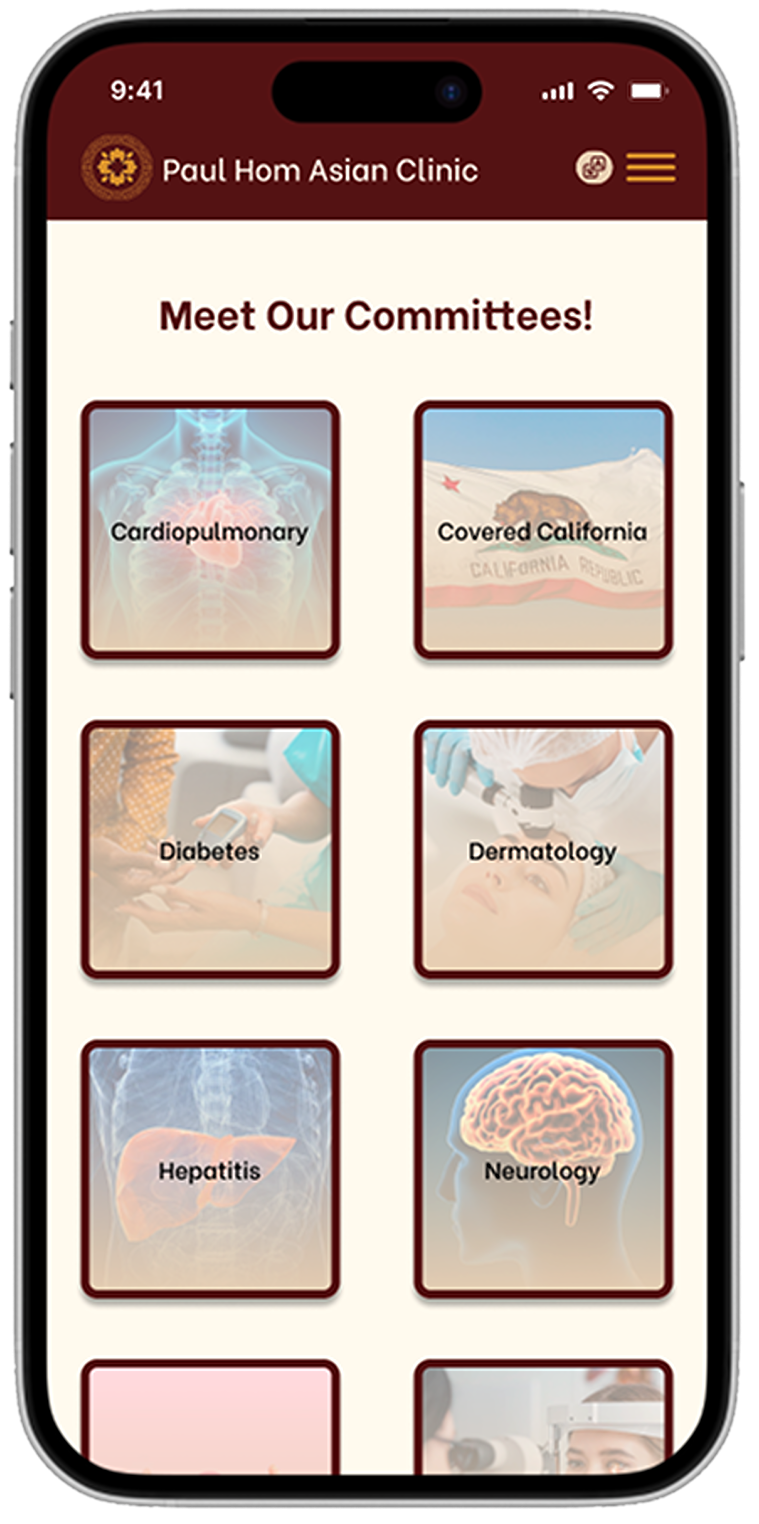
We transformed the text blocks on the 'Committees' page into clickable card buttons, reducing clutter and cognitive load, allowing users to easily access the information they need.

This image displays what it would look like when the user selected one of the cards for more information.
Next Steps
User Feedback
Survey and conduct usability testing, gathering real life applications of the website.
Validate Design Choices
Conduct A/B testing to compare different design solutions and ensure the refined prototypes meet the user's needs.
Refine Prototypes
After gathering feedback, identify points for improvement that are necessary for usability and ease of interaction and restructure through the prototypes.
Expand Testing Scenarios
Test the prototypes in diverse user environments and on different devices to ensure accessibility, inclusivity, and cross-platform compatibility.
