

RentBlue

Team
I worked with four other peers to collectively create this site
My Role
Style Guide
Usability Testing
Ideation Sketches
Messaging Feature
Tools
Figma
Paper Sketches
Iterations
2 Main Iterations
91 Total Frames
The Context
Finding off-campus housing as students in Ann Arbor is overwhelming due to scattered information, lack of transparency, and unreliable communication tools. This problem particularly affects newcomers and international students, making the process daunting.
The What…
The scattered nature of rental information—across websites, social media groups, and word-of-mouth—creates unnecessary stress for students. Improving transparency, consistency, and communication can significantly ease the housing search, enabling students to focus on their academic and personal goals.
The Why…
Design a website tailored to students that simplifies the housing search process. The website will offer straightforward search functionality for rentals and roommates and enhance communication between students, landlords, and other stakeholders, reducing stress and improving the overall experience.
The How…
My Design Process

Empathize
Learn about the users' frustrations, wants, and needs through informational interviews

Define
Leverage insights to identify the main problems to solve

Ideate
Brainstorm a multitude of potential solutions to the users' problems

Prototype
Create an early model of the product that demonstrates functionality

Test
Facilitate and observe user tests with the design prototype
User Research & Findings
We conducted 10 interviews in order to truly understand the housing challenges in Ann Arbor, Michigan.
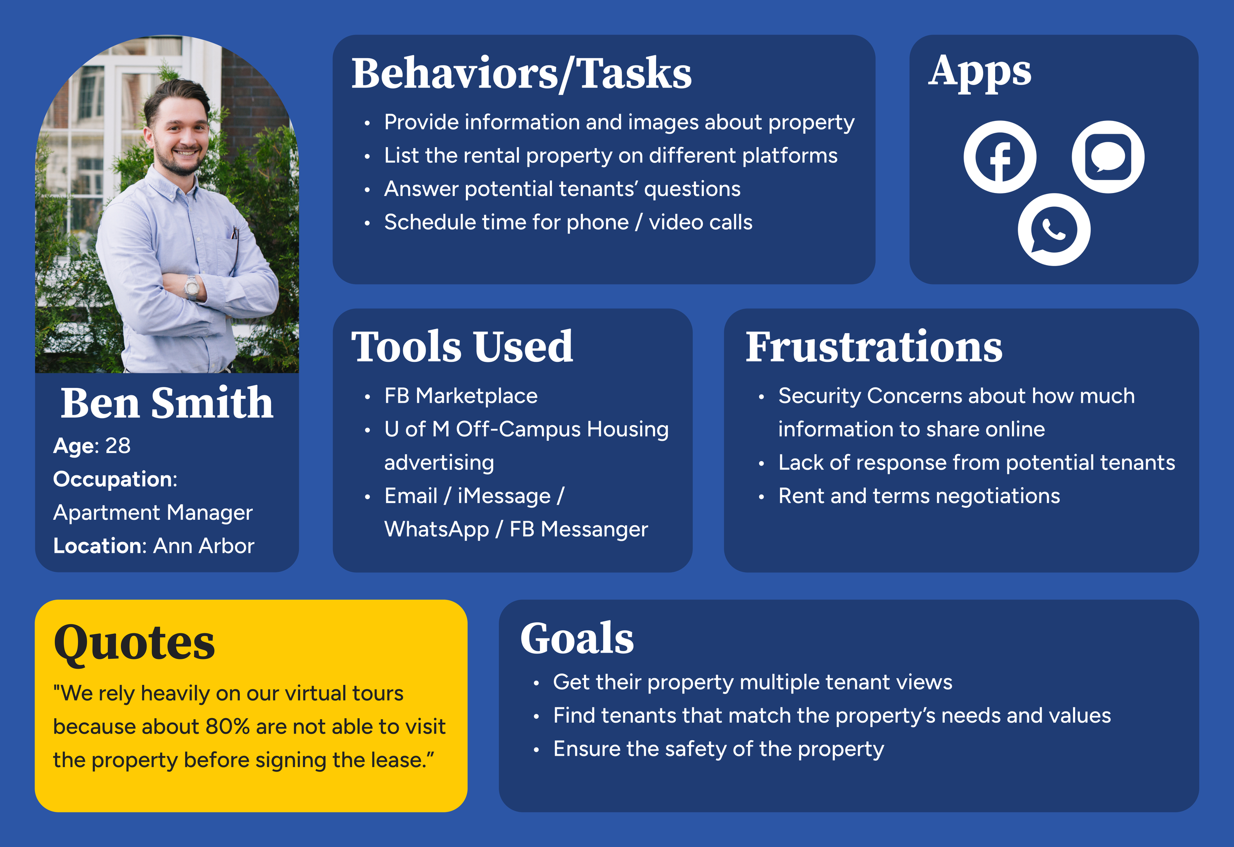
Stakeholder Voices
Prospective Tenant Interview
8 student interviewees shared their frustrations and unmet needs:
• Too many options and too little organization
• Lack of transparency
• Finding a roommate was a gamble
One international student said, “because I didn’t want to only rely on the staged images on the website, if I wasn’t able to FaceTime with them, I would have my husband reach out for me to get videos and photos.”
2 Property Owner interviewees highlighted the challenges below:
• Inefficient advertising
• Privacy concerns
• Communication gap
Property Owners
One property owner said, “my post just got lost in a flood of new ones, so it was hard for anyone to find it.”
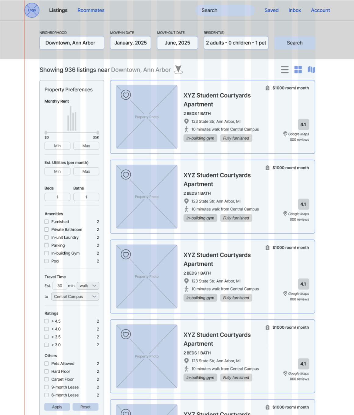
User Personas
Tenant

Property Owner
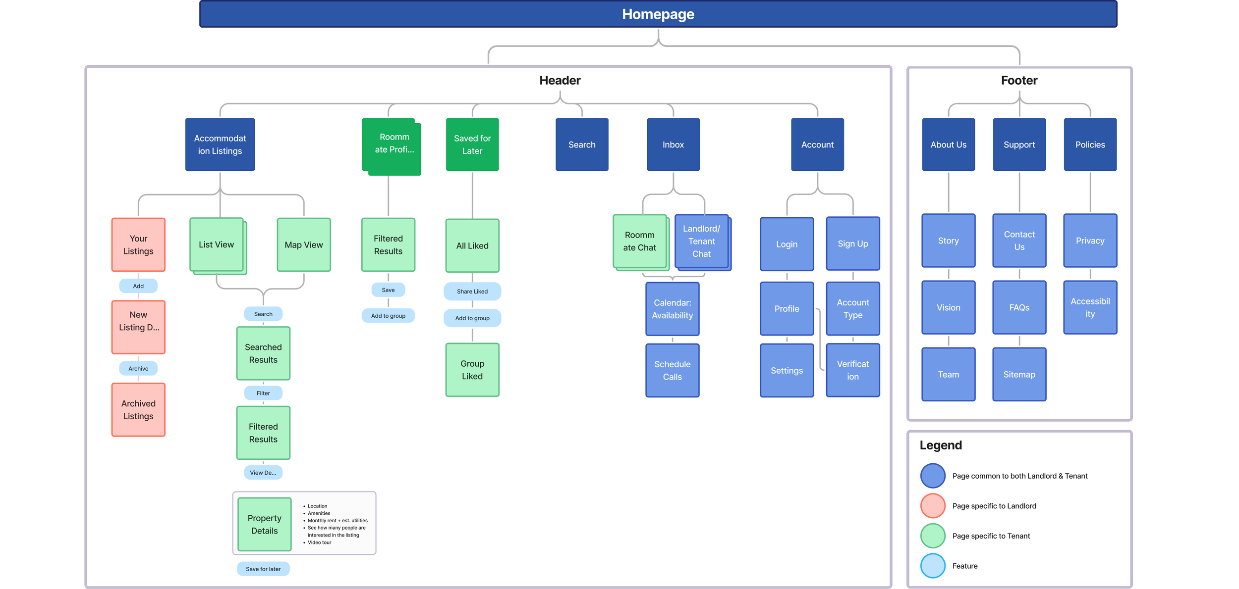
Information Architecture
Our information architecture offers a comprehensive and intuitive overview of our website, thoughtfully designed to cater to the needs of both property owner and tenants. The guide outlines shared and persona-specific pages, ensuring clarity and usability.
User Flow
We mapped out two main user flows for tenants and property owners to understand the user process better. The user flow follows Jesse James Garrett’s Visual Vocabulary, using:
• Rectangles for screens
• Circles for actions
• Triangles for decisions
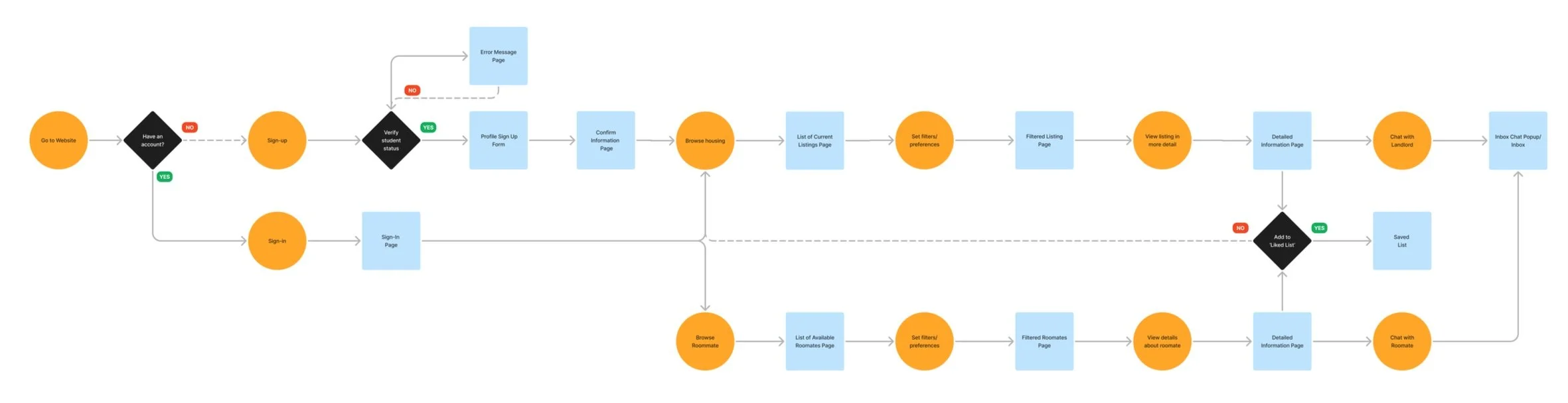
Tenant

Property Owner
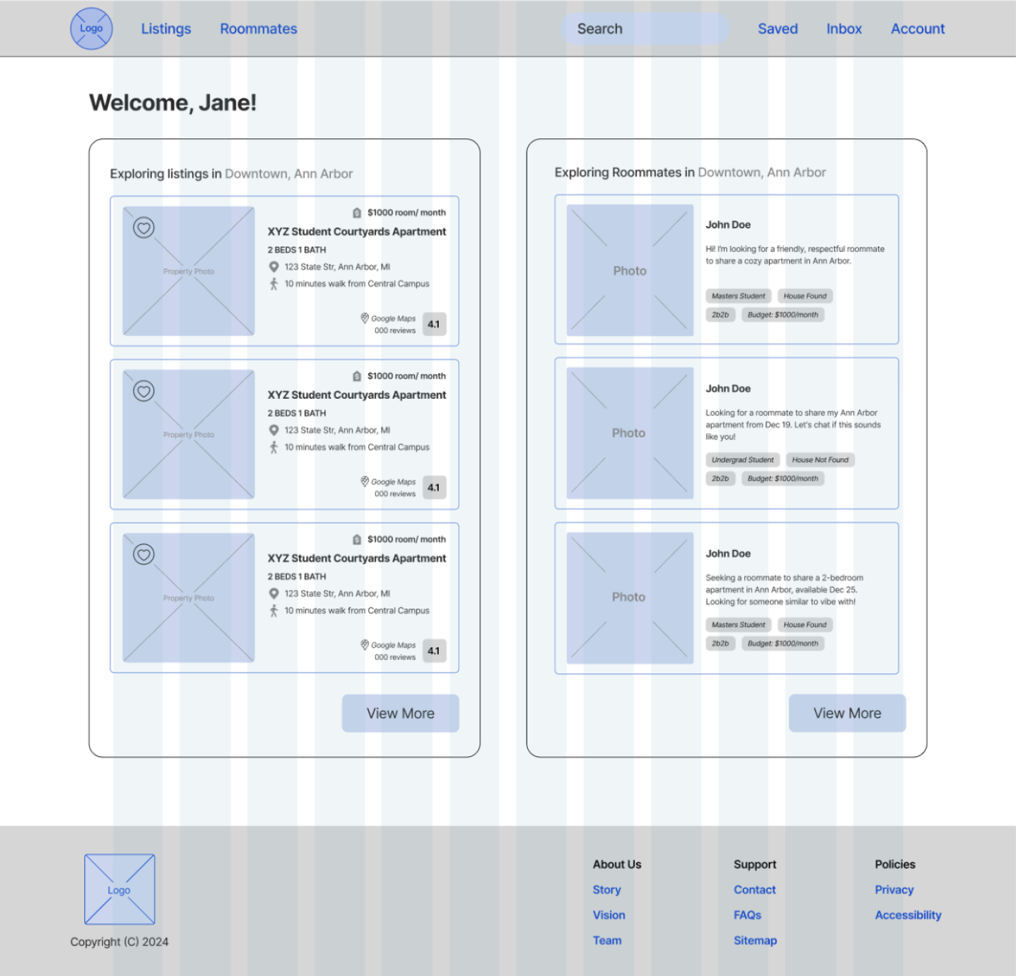
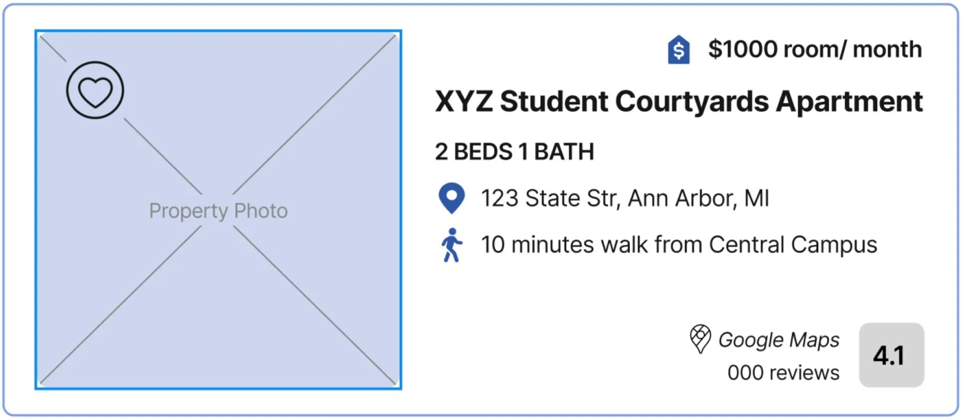
Mid-Fi Prototype
A competitive analysis of several housing sites including Booking.com and UMich Off-Campus Housing Website informed our designs.
Following conventional protocols, we implemented:
• A horizontal search bar for usability
• A vertical side filter menu for easy navigation
• A 12-column grid system ensures a consistent layout across pages
• Component-Based Design principles (Brown, 2011)
• Onboarding, property owner listings, and schedule tour processes are divided into small steps and sections to minimize cognitive load
12-Column Grid System

Horizontal Search Bar

Card Components and Vertical Filter Menu

Usability Testing
Objectives
The main goal of usability testing was to identify any usability challenges and gather feedback on the overall user experience. We focused on testing five primary features/tasks that could be completed:
For tenants:
Creating a Verified Account
Searching and Viewing Property Listings
Searching and Viewing Roommates Chatting with Roommates and Landlords
For property owners:
Listing a Property for Rent
Methodology
We conducted testing sessions with 10 participants, equally split between tenant and landlord personas. Each session included:
Participants verbalized their thoughts as they navigated the prototype, helping us understand their mental models and pain points.
Think-Aloud Protocol
Using Zoom, we captured participant screens and body language for post-session analysis.
Recording
Each session was moderated to ensure participants stayed on task while allowing deviations for unexpected insights.
Moderation
Sample Questions

Some sample questions asked during usability testing were:
Starting from the RentBlue homepage, how would you go about creating an account as a tenant?
Starting from the RentBlue homepage, how would you go about scheduling the call?
After logging into RentBlue, you land on the page shown. What steps would you take next to list your property?
Participants
Prospective Tenant Requirements
Between the ages 18 - 25 but the range could have increased to 25+ if needed
Pursuing any major(s) at the University of Michigan
Pursuing undergraduate and/or Masters/PhD programs
Should have previously used online platforms for accommodation searching
Should either be looking for housing or have previously looked for housing in Ann Arbor
Property Owner Requirements
Should own a property or work as a property manager in Ann Arbor
Should have previously used online platforms for listing a place for rent
Should either be looking to list a property for rent/lease or have previously listed a property for rent/lease
Results
The usability test revealed that participants generally appreciated the platform and its current stage of design, describing it as a useful tool for their accommodation-seeking and property-listing needs. While the core functionality resonated with users, they also provided valuable feedback on areas for improvement.
Feature Findability
7 of 10 participants indicated that certain features could be more discoverable by leveraging visual enhancements like icons and pop-out designs.
Affordance of Click Elements
5 of 10 participants suggested that enhancing the design of pictures and cards through a standardized design system could improve their click-ability and usability.
Button Wording
6 of 10 participants found the included features helpful but suggested refining the wording for better clarity and usability.
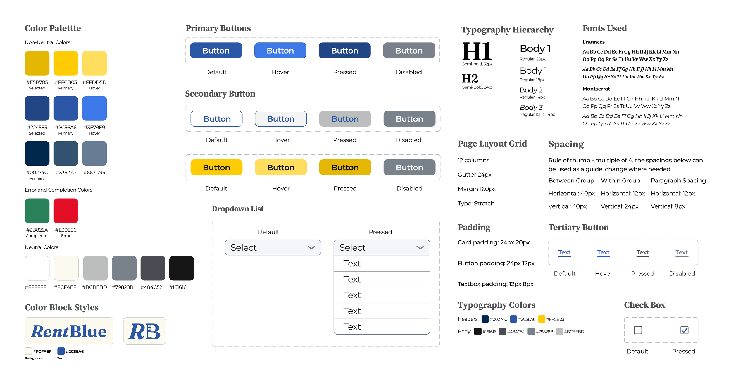
Style Guide & Visual Design
Our approach for the visual design was to create a color feel that is similar to the University of Michigan as the primary audience –tenants– will be students from the university. We selected ‘Fraunces’ for our headers and ‘Montserrat’ for our to have a friendly and welcoming, but professional feel to the site. We ensured our consistency by using a specified page layout with columns.
Iterations
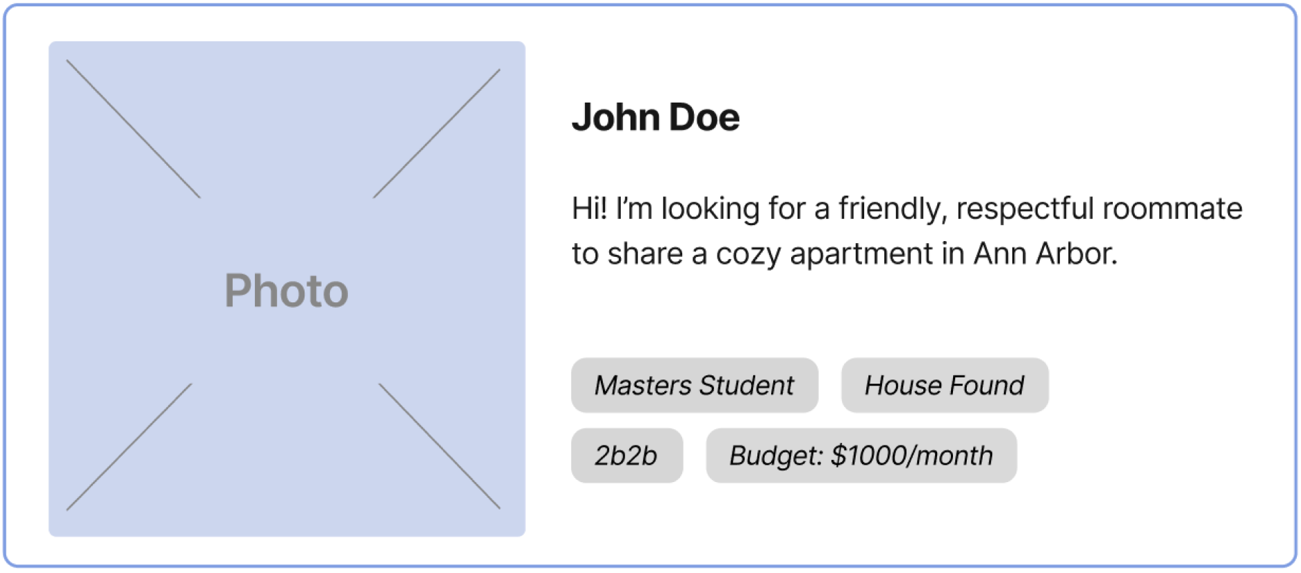
Roommate Listings
Wireframes
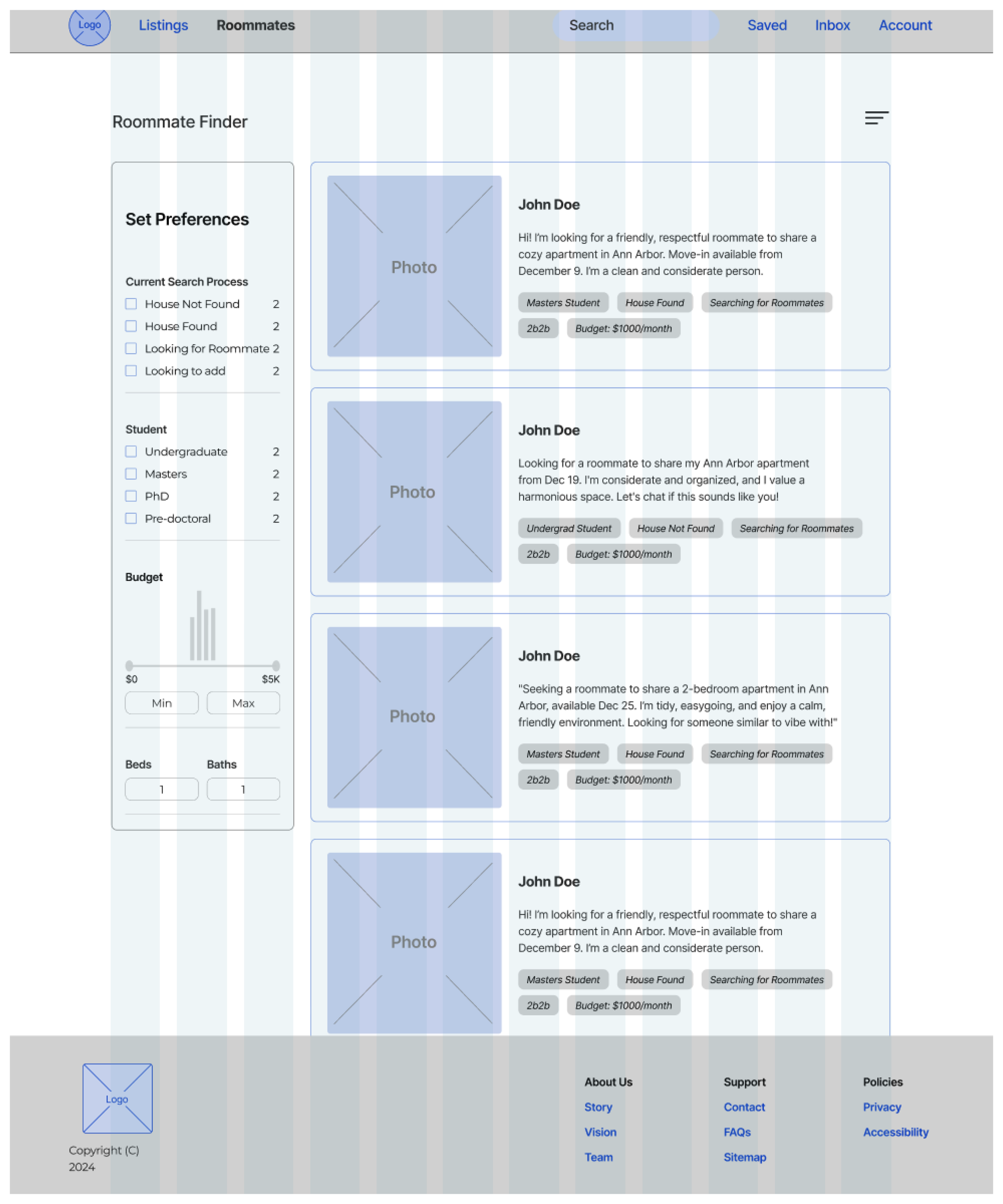

Hi-Fi Designs
Streamlining Header
"The top navigation bar could be more simple. Icons could make it more intuitive and streamlined." - Usability Test 3
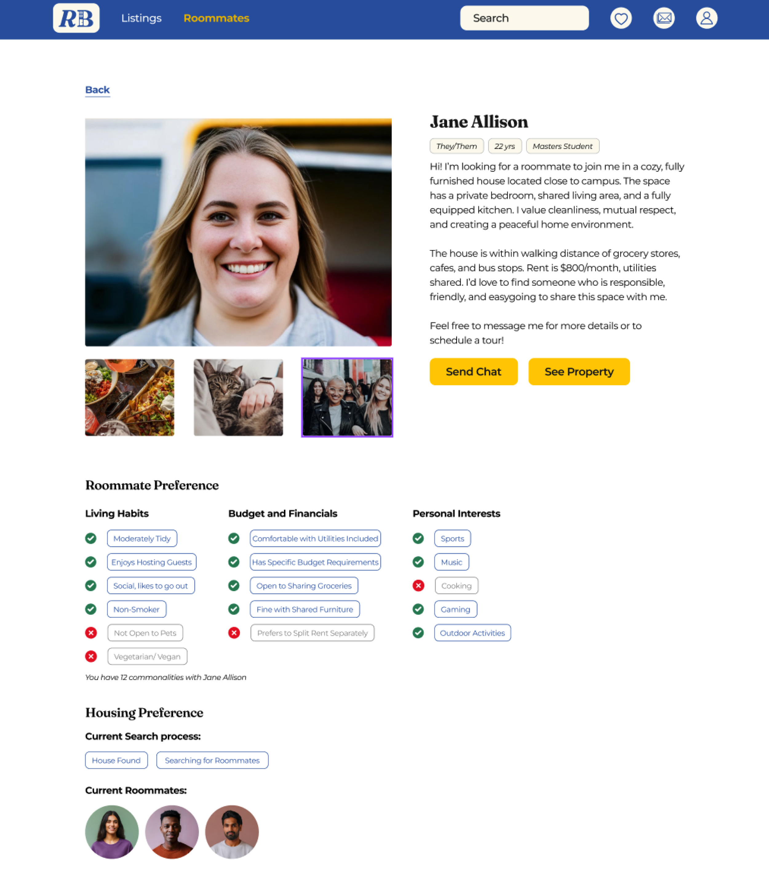
Consistent Branding
We applied consistent branding colors and full-color images across all pages, creating a polished design.
"I noticed there’s no back buttons in the Roommate expanded view" - Usability Test 8
Improved Navigation
Optimized Layout
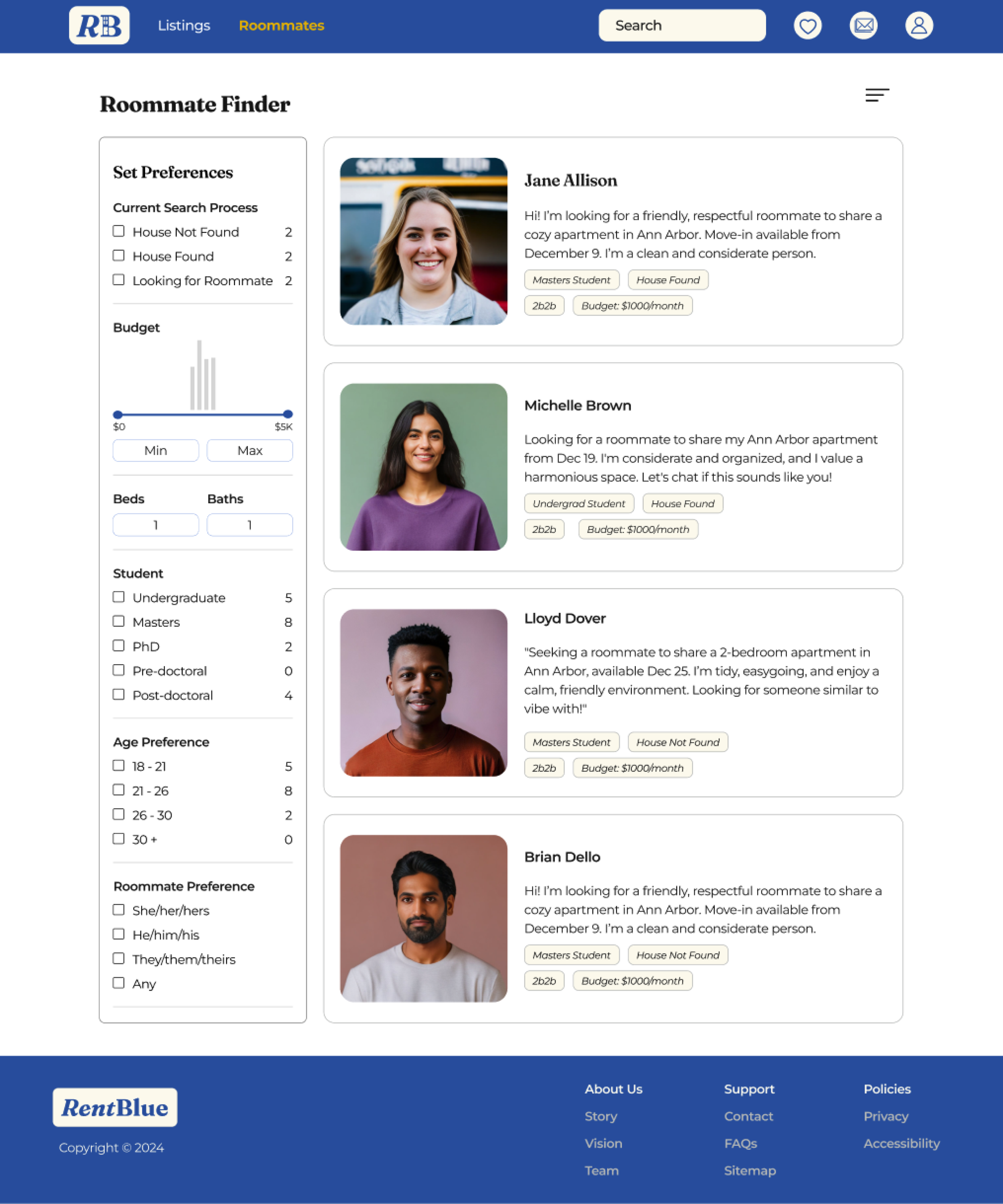
We reorganized the sidebar to prioritize key filters and enhanced usability with clickable color indicators.
We made buttons like ‘Send Chat’ and ‘See Property’ more visible with a higher contrast color, helping users quickly identify key actions.
Bold Action Buttons
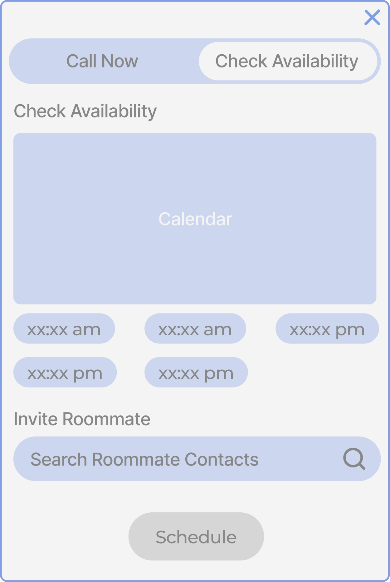
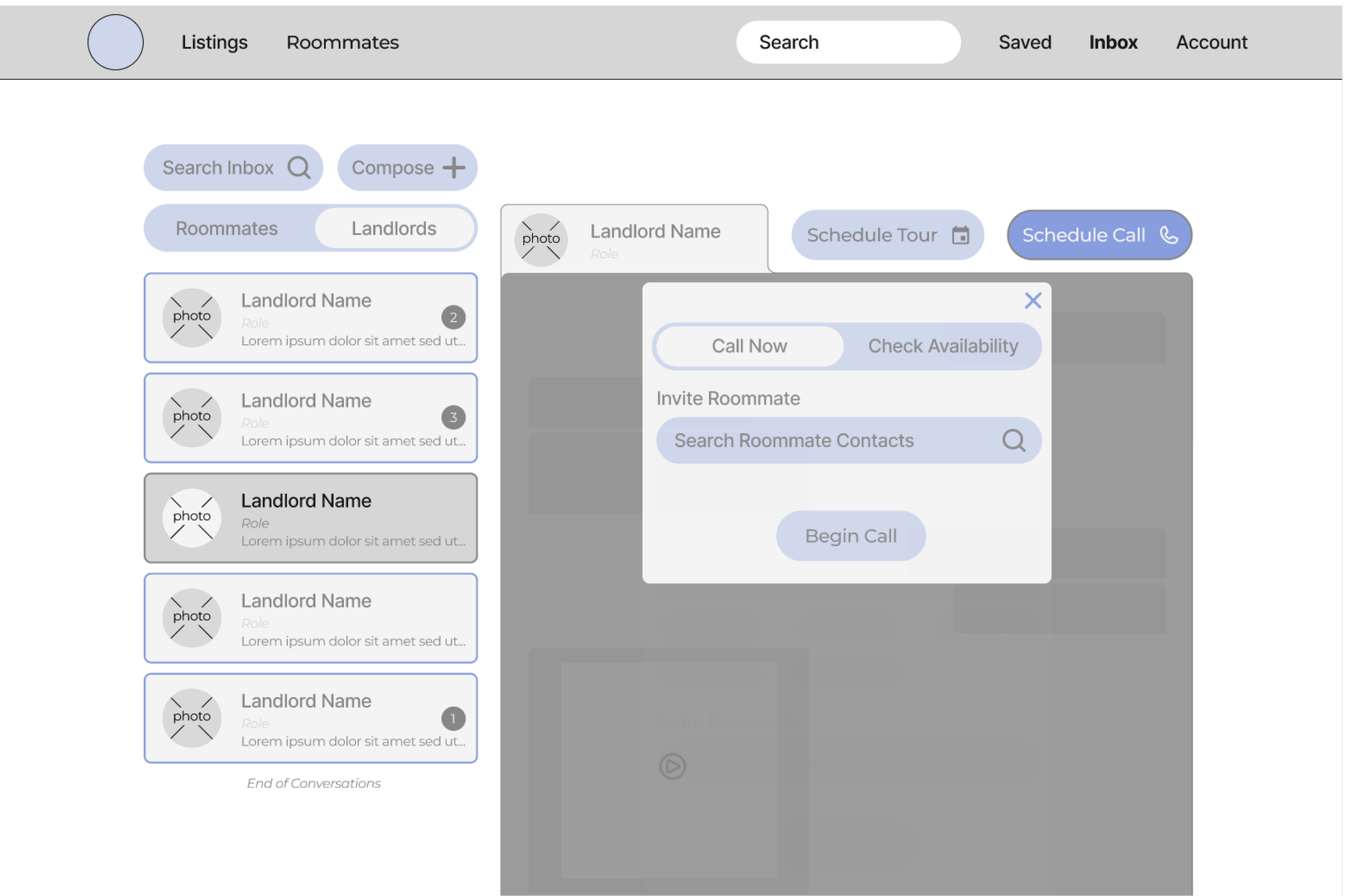
Schedule Calls - User Flow
Wireframes
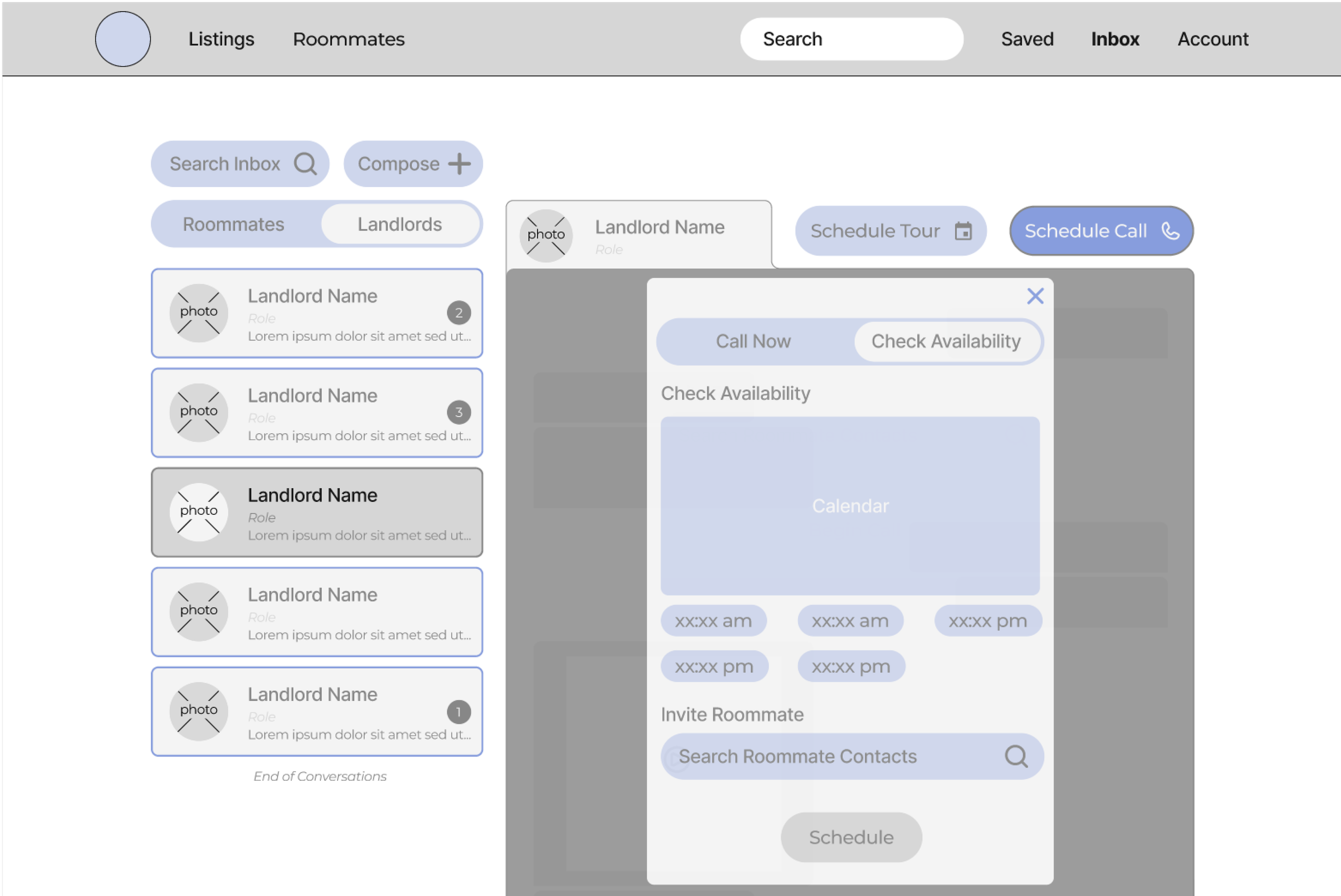
Hi-Fi Designs
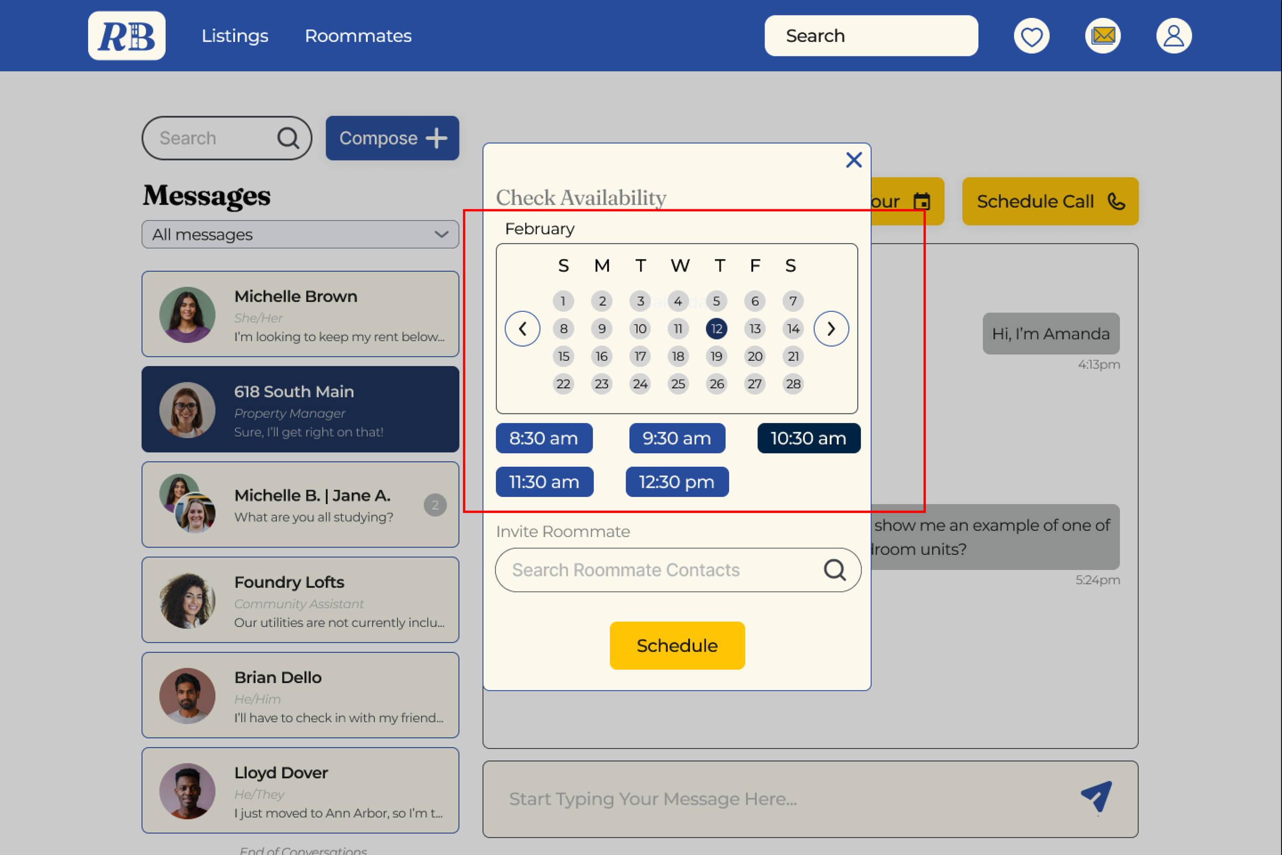
We updated the calendar view for scheduling calls, making the time slot selection for scheduling easier.
Positioned at the center of the page, this change enhances usability by focusing the user’s attention on that element.
Enhanced Scheduling
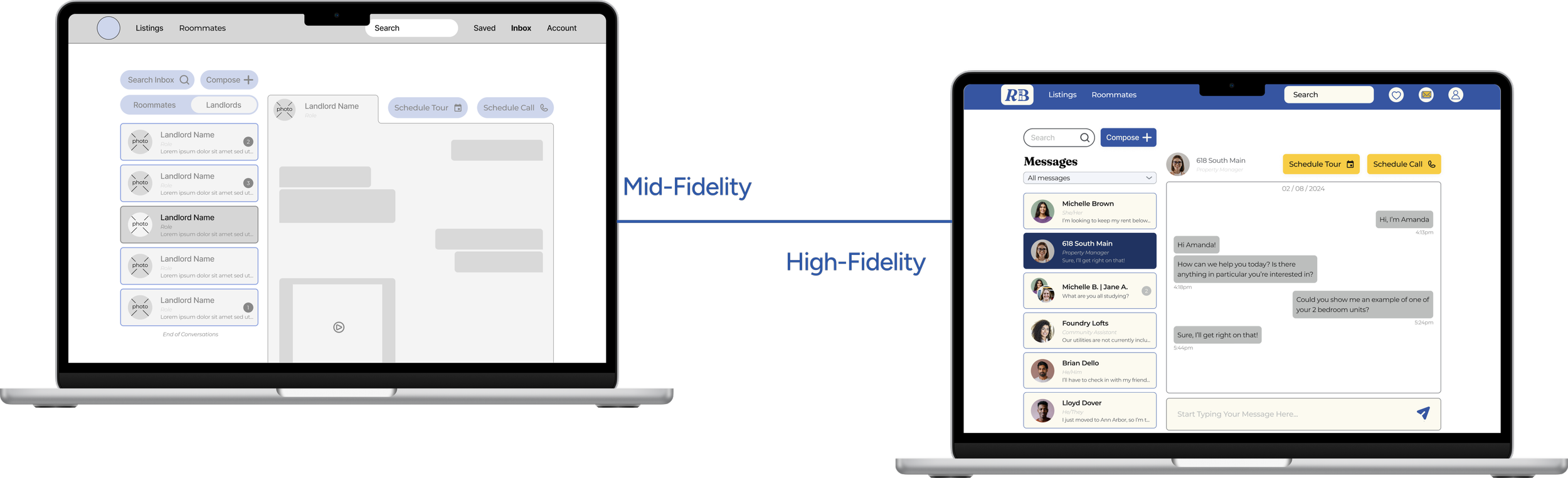
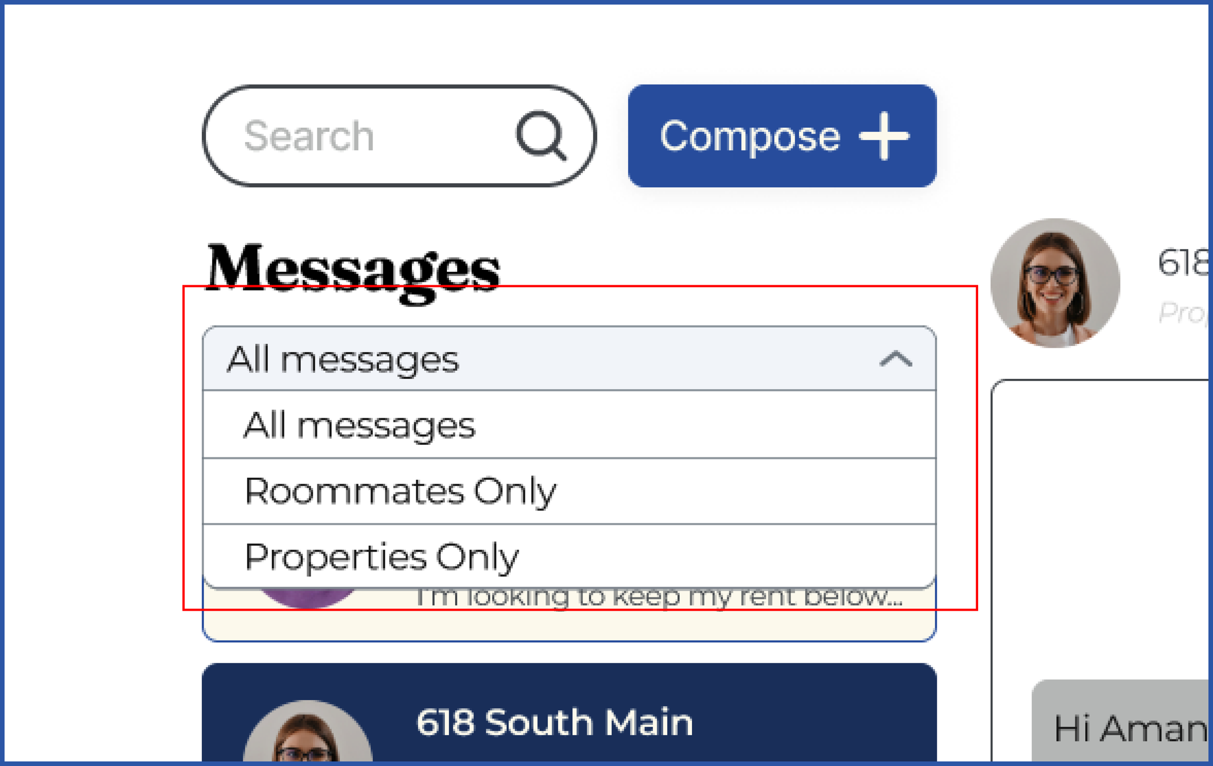
Interactive Messaging Filter
"It's kind of hard to understand the ‘Roommate’ and ‘Landlord’ switchable buttons, maybe there's another way to implement this?" -Usability Test 6
We created a dropdown to organize the messages, creating easier to navigation. This aligns with heuristic principles such as Error Prevention and Flexibility & Efficiency of Use (Nielsen Norman Group)
Impact
Impact on Tenants
Easy access to find a roommate that is guaranteed to be with the university and a list of preferences to gauge compatibility
Easier search for properties with a list and filters
Potential Negatives
The possibility of stalking with the roommate and property search feature
The potential for scamming
Impact on Properties
Easier access to lists of properties for tenants, leading to less need for advertising
Greater confidence in finding tenants that match their properties accommodations
Next Steps
Next Steps
We plan to develop a mobile-friendly version of our site to enhance accessibility for features like video calling, messaging, and notifications.
Roommate Card Swiping
We plan to introduce a swiping feature, inspired by Tinder, for an application-version to streamline the roommate matching process for users.
Home-Owner Verification
We plan to implement a verification system for property ownership or management to build trust and improve safety for tenants.
Usability Testing
We also plan to conduct further usability testing to ensure our changes are successful.
